Ray Larabie has been one of my heroes for quite some time, and I’ve wanted to chat with him since – the files on my computer tell me – late 2022.
Last year I had some commitments that kept me from reaching out, but as time went on, it started to seem like the universe didn’t want me to postpone the interview any further: I’d see his fonts at work, in the games I played, when peacefully scrolling through Instagram… you know I had to get this done at one point.
Well, now it’s February 22nd, 2024; the last longform, written interview with Ray was conducted well over a decade ago. Ray is eight hours ahead of me when at 11AM Rome, 7PM Tokyo, he tells me he’s ready for a call on Instagram.
Obligatory soulless introduction
Ray was born in Ottawa in 1970, and he’s been a font machine ever since: he has hundreds of them to his name, and as of this year, over 100 million downloads on DaFont. Number 3 in the world like Sinner, baby!
His fonts range from originals and homages to reworks of original typefaces and even copies of copies; if you see a font with a funny name, puns in the descriptions, or sample images with stilted speech, you know it’s his stuff.
You might recognize his work in the logos for: Grand Theft Auto (Pricedown), Red Dead Redemption (Chinese Rocks), Kojima Productions (Snasm), Mass Effect (Korataki)… or from the fonts on your Mac that Adam Neely decided he was too cool to use for his thumbnails one day (traitor – Coolvetica), the Olympic games, the new NASA rover… everything. Ray has effectively completed graphic design, reason why he’s been doing photo mode side quests as of late.
When his parents bought him a calligraphy set as a kid, instead of learning cursive (which he detested), he started drawing the alphabet in Helvetica. You can see why “pop” type, from supermarket signage to arcade game cabinet calligraphy, would become the main reference for Ray’s work.
Refresh my memory… where’d you get those Letraset sheets as a kid? I know you bought them from a store later on, but I’m talking as a kid, the very first time.
My grandmother worked at a government agency, where they used those. But when they’d run out of a letter–
– The As!
– they had to throw out the whole thing.
Ray’s house in rural Ontario was fairly isolated from the community, so when on break from school, he’d spend his free time programming and playing video games on his personal computer. The MobyGames bio will tell you everything you need to know about this part of his life.
Ray graduated in animation from Sheridan College in ’91. Bad timing, he says in a podcast, as cartoons were rapidly getting outsourced to Korea by the time he got the degree. Luckily his other teenage passions would help him go far, to what would end up becoming Rockstar Canada – where he’d soon be contributing with art and fonts to desktop computer games.
There’s some conflicting info on the date when you left Rockstar. Some say 2003, some 2004.
2003.
Earlier than I expected.
I just left, they were probably like… “what a jerk”! Hahaha!
You worked on PC games at first, but then you worked as an art director for PS2 ports.
I did the PS2 ports for Max Payne, Oni… I did the art direction for The Warriors on PS2, but I left before it was finished, so I’m not anywhere in the credits.
Well, they’re kinda dicks for that.
…I don’t know, maybe that’s just how things were at the time.
Why exactly did you leave?
I was uninterested. I enjoyed working on NES, SNES games. By 2003, it was boring.
Ray left Rockstar to focus on his foun– excuse me, font company. It all worked out in the end when you consider he and his wife have been running the current incarnation of Typodermic from their new home in Nagoya, Japan, since 2008.
Typodermic 2001-2008: the singles collection
Everytime I say I like a font he made, Ray says “Thank you”, like a streamer soundboard effect or a Pokémon chant. I feel it’s genuine for many of the fonts but I can’t tell if he’s 100% honest with it when this happens for one of the big names, as other people my age have possibly done his head in on the same cut.
There was a font that suddenly started selling two years after I released it. [Pause, thinking] …I can’t–
Built!
Yes!
You said that in the past. I like Built.
Thank you.
But you know what I don’t like about Built? [Pause] The pointy N.
Well, you have to blame Chanel for that. I saw it on a store window one day, and then all of sudden, all of my fonts had pointy Ns.
Not the first time this happened.
So there’s this guy on Twitter who reworks Star Wars fonts. Ethnocentric was used by something Star Wars one time, and he was like… “Ethnocentric, Ray, why’d you call it like that”?!
Okay, so, it was a boring day in this town called… let me see if I… Port Dover! In Southern Ontario. I saw this sign on the window of a salon. I liked how it looked and wanted to turn it into a font. And later on, when I got back to that salon, the sign was still up, but it looked completely different! Somehow, it had become something else in my head by the time I got home. […] Thinking about it now, Ethnocentric looks very similar to the Battlestar Galactica logo.
Ethnocentric’s effect on us ends up being an unexpected byproduct of Ray’s trademark word choices, accidentally clashing with the word’s actual connotations and current wider usage. In the ‘90s, “Ethnocentric wasn’t a word that people used”.
That’s my spur, I don’t know you
Ray says he follows trends when working on new fonts – but that is, sadly, not enough to affect the market: his oldest fonts and most of the ones that came out after 2010, barring a few exceptions, apparently don’t sell well.
And some of the “classics”? They haunt him.
I get contacted by kids studying design who are doing presentations all the time. And every time, they ask me about my worst fonts.
Wait, wait. Are we talking about… a design high school’s students, or college students?
They’re college students.
But… they’re 21. Why are they making them do show and tell in college?
I don’t know. But the teachers must be disappointed. “Oh. They picked Ray again”.
[Laughter]
The fact that they choose me makes me lose my mind. Choose someone else!
You know that thing Kanye said one time? Picasso is dead! Walt Disney is dead!–
[Snicker]
– Frutiger is dead! I mean, who are you gonna write to?!
[Pause, then deadpan] …Mark Simonson.
…Oh, I know him.
I know him too. Yeah.
Someone that’s old.
“You gotta be a million years old to know all of this”, he told me, since the landscape has changed: when he was young, you always had “the same three typefaces in rotation”. Nowadays, those classics have stuck, but there’s many more names you have to remember.
So which fonts would you talk to me about?
None in particular, I thought, but I went off like this:
You have a font named after my region.
[Pause] Really? I do?
Yeah, kinda. Ligurino.
Uhmmm… you know, when I was looking up words for the name of the font like I do, and… I actually think a ligurino is gay slang for someone like a twink. Hehe!
Ironically, that was true. The term “ligurino” has been loosely associated with gay people for some time, thanks to Horace, from before it was associated with coinage or ligurians in general in other Italian dialects. Would you look at that…
Do stop the beat and go away
Ray was aware he and the other “free font guys” were outsiders by the time he attended his first TypeCon in New York State, 2001. That was a month before Larabiefonts would give way to Typodermic.
I was on a bus to Napa Valley – it was my second TypeCon, in 2004. I was talking to someone. They told me they were selling fonts on the internet, and I told them, “I’m glad that through my website I can get to give fonts to people for free”. Matthew Carter was seated close by, and when he overheard us, he just let out one of these: [huge sigh]!
“My advice is, learn about fonts instead. I’d ask myself, is it productive to have new fonts? I feel like I’m slamming the door on people because I started in the ‘90s, but this is the total truth”
Ray is well-versed in the world of sci-fi. Of course he knows about Nebiolo’s works; after all, he was the original techno font pioneer.
Microgramma, Eurostile…
You know Stop?
Yeah. Sequential Circuits.
When I was a kid, Stop looked like it was from the future.
Going back to universities: Italy had it all at one point. Then every foundry shut down – we have two and a half foundries right now. And there’s no more proper type design degrees anymore.
I feel bad for kids graduating in type design. My advice is, learn about fonts instead. I’d ask myself, is it productive to have new fonts? I feel like I’m slamming the door on people because I started in the ‘90s, but this is the total truth.
Mesmerize’s Canadian odyssey
For the Canadian sesquicentennial, Ray was contacted by the government: they wanted to use his Mesmerize typeface for the celebrations. A font made by a Canadian that was ready to go was what they were looking for, as they’d later go on to state.
But for Ray, it was nowhere near fully finished: to be a complete Canadian font, in his opinion, it needed to support every Canadian language, not just English and French. That meant adding indigenous alphabets.
After some commendable research and a few bureaucratic issues (they went as far as telling him to specify the inclusivity was “his idea”, in case there was a backlash), Ray managed to get it done – and for it to display right too. Thus Mesmerize became Canada150.
Not so fast
When news of a free font making the government save money reached the public, the Canadian Association of Registered Graphic Designers was ripe with ire – because the whole thing was just as bad as spec work for them, which they forbid members from engaging with. Their reasoning is that it would devalue an already often mistreated profession, which is understandable.
Then-RGD president Adrian Jean spoke to Global News, protesting the government’s decisions of 1. choosing a free typeface, and 2. organising a logo contest with a prize of five grand CAD rather than putting the various tens of thousands of dollars, stashed for designers exclusively, to proper use. As a result, Ray was caught in the crossfire and had to stand his ground.
One of the two big questions I prepared for this interview (with the other one coming in two paragraphs) was formulated to help tie this loose end: what did people think of Mesmerize? The articles from that time didn’t talk about it.
The best article on this topic is by far the CanadianArt one, where they talk to Kevin Brousseau, the Cree linguist who helped fix those Unicode issues. He says he’s not surprised a single guy was behind it all, they talk to some other activists, but then it ends there. So there’s just the initial controversy about Canada150 and it really dies there. I want to know, what was Mesmerize’s actual reception?
Nobody cared.
Not exactly wrong as he claims he didn’t really see it in use when he went back to the country in 2017, but the government was nice enough to put him in a VIP lounge not too far from Prince Charles during the celebration.
Nobody? Nobody? Just Kevin? You didn’t ever get an email saying… “thank you, I can communicate in Cree on the internet now”?
No! I think nobody uses it! It’s not an interesting font.
Following a brief parenthesis on the topic of representation, I asked Ray whether he got any orientalism accusations from westerners for his now rehauled and CW’d classic, Electroharmonix. Turns out, nobody ever went up to him to complain. But he did get one email from a sign maker in Japan, telling him his font… worked great on an experimental sign of theirs for an expo.
It doesn’t stop there:
There was a Japanese game show where they had to make contestants read sentences in Electroharmonix. But nobody could read them, so they had to cancel the whole segment!
Luckily, it did end up on Japanese TV in the end. Just not how it was originally intended to.
Mesmerize’s space… balls
Talking our way back to Mesmerize to set the record straight…
…And then you got contacted by, RIP, Constance Adams.
Yes!
Ray was contacted to adapt Mesmerize for a mission to Mars. So he turned Canada150 into Canada1500, added some space-themed icons to it, and released it into the public domain. His other font Nasalization, based on the iconic NASA tapeworm logo that’s been favourably reassessed by the masses these days, also wound up in the project.
…You know, you’re kinda modest about this. I wouldn’t be so humble if I had my… designs on the side of a rover!
I don’t know. I don’t think it’s that good.
But it is on a NASA rover.
It’s not good! I’m telling you, it’s not that great… for example, Mesmerize’s medium width is not nice.
(Canada1500 is indeed mono-width).

You know though – Nasalization is on the rover itself, but I haven’t seen Canada1500 used anywhere in the end? I think they use Montserrat and another unrelated sans serif on the website.
…Really?
We both start furiously googling, and the discussion eventually devolves into how much I hate Montserrat.
Second impact
So, I wrote this question back in 2023: you’re a straight guy in your fifties, and the entire industry was full of people like you decades ago. Nowadays on Twitter you see designers and artists working in your field who have the most varied backgrounds and identities, along with all the kids getting into Y2K. Do you feel some sort of cultural or age divide?
Ray’s answer takes on a much more utilitarian perspective than you’d expect.
I try to make things that that generation is gonna go “ohhh, that’s just what I need for this project”. Simple as that.
I’m not making art. I’m making art supplies for these designers to make stuff that’ll make people buy things. I care about this much more than what other font designers my age think about me. Whatever other font designers my age are doing is of no relevance to what those other people are gonna need.
I wanna tune into whatever the hell they’re interested in. That’s why I’m always trying to tune in – that’s why I tried to jump on the Y2K wagon.
You rock with Froyo Tam, right? You were talking to her on Twitter. I didn’t quite vibe with her earlier stuff, but I think she’s locked in now – her latest font, the last logo she’s made, all the motion graphics – they’re great.
I’ve actually been on board with her since the start. Her work is just up my alley.
“She’s dedicated”, he says. Ray loves the “[retro] displays, the backstory”, “everything about it”.
But I’m an old guy, I’m not making things for [the younger generations]. And I think that if I catch the trend, I might be of help.
Right now Gen Z has the creative power, but it’s the millennials that still dictate the sales.
Gen Z, Gen Alpha, they’re bringing back… these sort of fonts with a Bratz vibe. And I think that’s their way of rejecting minimalism.
“I’m not making art. I’m making art supplies. […] I care about this much more than what other font designers my age think about me. Whatever other font designers my age are doing is of no relevance to what those other people are gonna need”
Ray was disinterested in hipster coffeehouse fonts in the 2010s, and he hates the “nouvelle psychedelic shit” [own words] that’s going on now.
We talked about quirky fonts before. I love Comic Sans. I would never use it, but I love Comic Sans. And the reinterpretations they’re making, like Comic Neue. They’re so legible.
I feel like [hating on Comic Sans, etc.] is an… enthusiast thing. Do actual designers really hate Comic Sans and Papyrus? The uppercase letters of Papyrus, of course.
You heard that, you fucking redditors? He’s right, by the way. Ask actual designers.
That said, don’t be too impressed by Ray’s kindness. He still isn’t on board with mom script fonts.
My thing about script fonts is: I don’t think they’re bad. But personally, I’m not interested.
Loadsemone
By the way, this one’s from personal curiosity. When it comes to subscriptions, we can easily quantify Spotify earnings with all the parameters [I’ll spare readers the precise details here], but on things like Adobe Fonts, how is a font’s usage even quantified? By the amount of people using it for a certain time? You get paid every year, month? How?
After a while, I get a huge spreadsheet with tons of tiny numbers. I don’t look at those. I just look at the one at the bottom, which is a fat number, and I feel good about it.
So it pays well? Huh…
Yes. The checks are bigger than all of my distributors combined. But they have to pick you.
So you can’t just go there and ask them to put your fonts up for download.
No.
You know what you should get onto Adobe Fonts? Dealerplate.
Ugh, I wish I could.
That would be a hit.
I tried to.
Ray was on the starting roster of Adobe Typekit, later known as Adobe Fonts. Despite that, he has little say on what fonts get to be added. And regarding the font selection, he says it’s the same with Monotype’s subscription service too – but their weird rules about font pricing are why he hasn’t joined yet. Many other designers on TypeDrawers aren’t cool with them either. Perhaps, in the future…
No such thing as free time
“I go through phases. I burn through phases like nothing. These days, I’m into glam, ’66 UK stuff”.
Ray picked up synths again as a hobby, releasing some tracks on his Soundcloud under a CC0 licence. Making music was originally a trick to get himself off of the computer, which at a point starts “taking a toll on your body, especially as you get older”.
For a man who told me it takes him just one hour to kern a font, he said he’d spent hours on mixing a track, which defeated the purpose of doing all of this right from the get-go.
To cope further, Ray tried to pull off some of Brian Eno’s Oblique Strategies thanks to an online generator (don’t know what Oblique Strategies is? Imagine Cards Against Humanity but for pretentious, rather than for annoying people). Go outside, shut the door: all ideas to help him stay away from the computer.
Conthrax came from an Oblique card. It was, “Be boring”. Ray doesn’t really like it, but it’s one of his best sellers.
But as soon as he went DAWless, with his Korg Electribe 2 on the coffee table, he started asking himself things like: “what if I get a MIDI keyboard that I can hook up to something, for ease?”… and there he was in front of a screen again because of trickle-down convenience gymnastics gone wrong.
Are you an Ableton guy?
No. I have… FL Studio.
Paid for, licensed?
Yes.
We’re twins. We’re twins. I’m an Image-Line head, basically.
By the way, fun fact: Conthrax came from an Oblique card. It was, “Be boring”. Ray doesn’t really like it, but it’s one of his best sellers.
Late-minute Rockstar bean spillage
When I was at Rockstar, so many games I was working on got cancelled. We had a World War II game, and a GTA game – put this in the article [sic] – that was called GTA Y2K.
GTA Y2K? So it would’ve been, kinda similar to–
Oh, sorry – GTA 2K. I did Grand Theft Auto London – I photographed all the cars, I did all the pixel graphics, I did all the world textures, I did the… UI, and then I did a little bit of the graphics for GTA 2K. Like, some missions were made for it, and then it got cancelled – it never got finished, we only ever did a cover disc image for a UK gaming magazine.
Nothing turns up on Google, even with the quotes. There’s a GTA 2.5 but that’s a Rockstar North thing. This is interesting, I’ll take note.
So, have you seen the GTA6 trailer?
No…
Why?
[Pause] …I’m not into GTA.
Weirdly enough, that is correct, as Ray has made it evident that he prefers handheld games in the past. He’s a Switch and 3DS guy now. Funnily enough, the day before the interview I was thinking: if Mesmerize isn’t a System of a Down reference, it might be a Pokémon one…
Going back to the topic of fonts, the last things I ask for him to opine on are the new ligature and slight character modifications in the GTA6 logo, which I’m quite critical of.
Oh, I see what they’re doing. They’re trying to bring Theft closer. The gap is smaller.
Wouldn’t it have been smarter to move the Auto away?…
3 hours, 45 minutes, one technical hiccup due to Ray firing up a YouTube video of another cancelled game he worked on and making his Instagram call tab crash later, we both decide to wrap it up.
✨
Spotlight
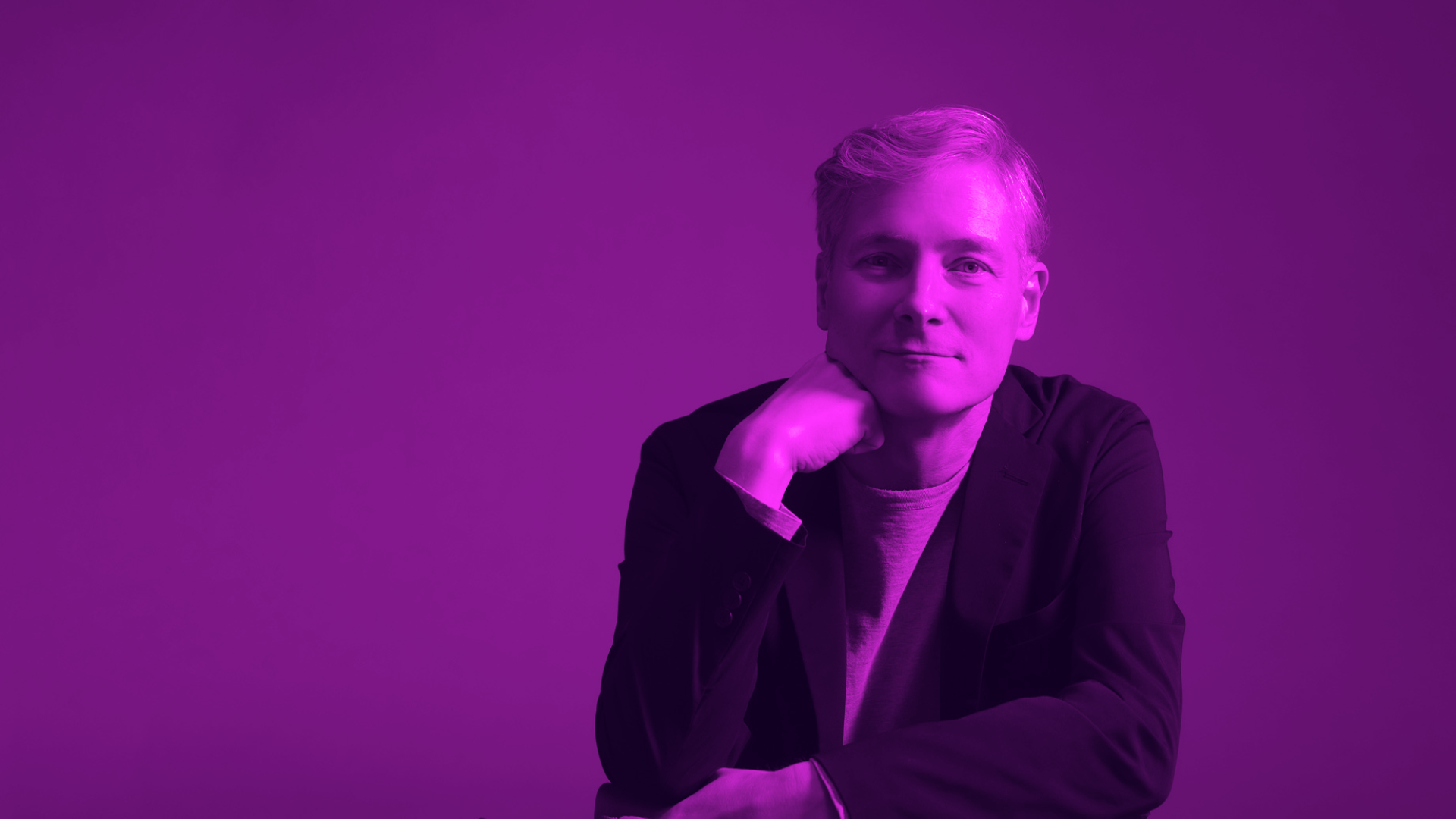
Raymond “Ray” Larabie (stress that first syllable) lives in Japan with his wife Chikako and their two dogs. In his free time, he does podcasts, street photography – not the irritating kind – and music.
You can buy his fonts from multiple distributors, or install many of them right away through Adobe Fonts. Any family from Typodermic is really inexpensive compared to what competitors put out. Worthy of note: Xyzai, his best Y2K font in my opinion, was bought by three people only; I’m astounded it hasn’t been featured in a game logo yet.
And of course… if you have no money, there’s his stuff on DaFont or in the public domain. Just read the fine print!
This website has no ads, and its contents are free for everyone. But if you liked what you just read, think of lending a hand: a donation of 3€/$3/£3 on Ko-fi can cover a month’s worth of hosting! Thanks.
Donate